
It’s natural to judge a book by its cover. A cut-and-pasted image salad that screams “middle school collage project” delivers an immediately unpleasant visceral impact, and casts a shadow on the content itself before prospective readers even open it. Many of them probably won’t. But a tasteful, elegant window into the literary wonders you have in store for the reading public can be an invitation too compelling to refuse. Below you’ll see the detailed progression of my own novel’s cover from two contrasting first drafts to a stellar final product, designed by the experts at damonza.com
Certainly many indie authors are on a tight budget and search for the most economical options to make their books marketable. I personally opted for what I judged to be in the top tier of book design, as well as editing (my editor is Karen Conlin—highly recommended) and now that my debut novel has been on the market for just over three months, I am very satisfied with that investment.
I entrusted the essential task of creating an arresting cover for my epic fantasy novel, A Facet for the Gem, to the book design professionals at Damonza. Not only does their extensive portfolio showcase striking covers in the fantasy genre and beyond it, but I was also persuaded by other customers’ high praise of their courtesy and professionalism, which I came to experience firsthand.
I initially envisioned the book’s cover depicting a very defining scene from the narrative, but they advise specifically against that on their webpage, as it can attempt to convey too much information in the imagery without context. So instead I provided them a highly detailed synopsis of the whole story, indicated what I thought would capture its essence on the cover, and deferred to their artistic talent. This paragraph from my submission highlights the elements I gave them to work with:
“The heart of this story, and the entire 4-part series, is Morlen’s friendship with the giant eagle, Roftome. I would really like to see them both on the cover. Morlen goes from 16 to 17 years old in this book—he’s tall with shoulder length brown hair, and wears a brown cloak. I would love to see him holding the Crystal Blade in his right hand, and the Goldshard in his left, as this symbolizes his internal struggle between realizing his potential, and his dependency on the Goldshard.”
They advertise a 14 day turnaround, but Alisha the designer got back to me just one week later with 2 drafts for the e-book. This is the first one that I saw:

She gave me exactly what I asked for with this one, and I think that’s why I favored it initially after considering them both. It captures Morlen’s internal struggle between trusting in his own abilities, symbolized by the sword he arduously earned in his right hand, and the security and power offered by the Goldshard in his left.
But, referring to the pitfall I mentioned a few paragraphs back, that’s a lot of information to convey in an image without any context. Prospective readers don’t know this protagonist or his dilemma yet; this image is supposed to entice them to experience it, not define it straight away. And I wonder, Alisha being the pro that she is, if this was her way of saying, “Here’s what you envisioned, but I can do better.”
This is the second one that I looked at:

First of all, the eagle is much more present and attractive here, and comes across much more clearly as being giant and otherworldly. The detail in the sword’s winged hilt is beautiful and went beyond what I’d described. But also the entire picture has a more open and kinetic feel, immediately beckoning the reader to embark with these characters on an adventure.
After soaking them both in, and asking for input from a few people close to me, I of course chose the second for my cover. I revealed it to friends on social media, and got additional helpful input as a result. The only revisions I went on to request were:
To lighten Morlen’s cloak a bit, as I felt the “Kylo Ren” look depicted a brooding antihero that doesn’t fit his character. Make the Crystal Blade look more solid and defined. And to make the Goldshard in his left hand like a flat, jagged piece of metal and less orb-like.
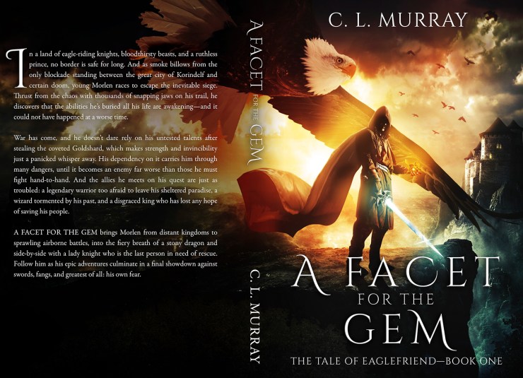
She got back to me the very next day with this final product:

I have no doubt that this stunning cover has contributed greatly to the book’s sales, as it frequently garners praise on social media while I promote it. The full paperback cover is at the head of this post, and it blew me away as well.
I went on to enlist Damonza’s formatting service for the book’s interior, and was very pleased with the professional, elegant result. I fully intend to hire them for Book 2 in “The Tale of Eaglefriend,” which I plan to release in Spring of 2017.

Damonza book cover is THE ABSOLUTE MASTER TOUCH. There is no entity exercising the same services I could realistically compare them to. None. Thanks, for the great job!
If you value your work, you are at the right door!!!
LikeLike